I bought this sign a few months ago…..
From Decor Steals….LOVE this site….
It’s been leaning against a cabinet waiting for a home…..
The other night, I suddenly realized just where it should go….
There’s nothing wrong with this already…to me anyway…more English style….
I told you about this picture here…
But, it’s literally looked like this for years….really..
So I decided the Farmhouse style was going to migrate from the kitchen to the breakfast area…….
(you can see pics of the kitchen and breakfast area here)
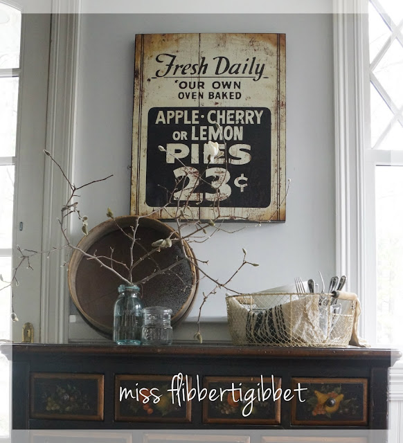
The sign went up first….
Then a rusty old sieve that is usually hanging from the pot rack…
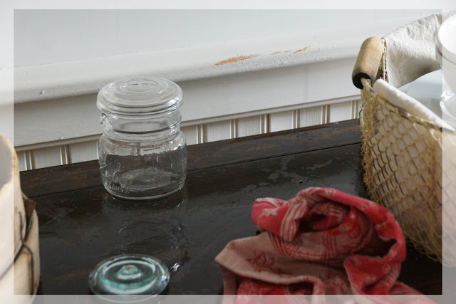
I took a couple glass jars from my Pinterest copycat arrangement….
Added some cut branches from the star magnolia….just budding now…
Lined a metal basket with some faux grain sack fabric….
And filled it with some white dishes and silverware……
About 20 minutes later I was done…….
Until I decided that the sign was a bit crooked…..
No problem…lift it down and readjust the hanger…..
Oops….
OK……20 minutes plus 20 more minutes for cleanup and paint application….
But if you’re not a klutz….you can do it in 20 minutes….honest…
I love the fresh new look!
I promise, I’ll show you where I relocated the old stuff!
And…on Monday stop back to see the final result of this.


 I'm Lorraine. I have a love for home & design and I enjoy sharing that passion with others. I'm so glad you're here to join me.
email: missflibbertigibbet@gmail.com


Nice little transformation, Lorraine! I loved your old look, too {love transferware}, but you gave this area such a nice and totally different look in such a small amount of time.
beautiful display! Love that sign!!!!
Hi Lorraine! As much as I liked that fruit painting and your beautiful dish display — I LOVE the new set-up! It’s perfect. Well, except for the spilled water and chipped paint — but you know, that’s all in a day of decorating! Beautiful! (Crazy about that sign!) ~Sally
I love that sign. Perfect and so farm house charming. Love your new look.
What a cool sign!I have seen those but it was hard to tell from photos how nice it was.Looking at yours I see I missed out a a good deal! Looks perfect in your beautiful home!
xx
Anne
Pinning the sign, I love it, well the whole vignette of course looks great, but I’m partial to the sign.
Bliss
Hi Lorraine,
Your breakfast area turned out wonderful. I love the fresh updated look. It was so nice before, but even better now.
The fruit design on the chest is awesome. What a treasured piece. I’ve painted many a design similar over the years for my clients on chests, tables etc.
The sign is fabulous too. Have a great rest of the weekend.
hugs, Celestina Marie
Can’t decide if I’m more in love with your new sign, or your AMAZING windows!!!
♥Linsey
Hey I love the way this looks! That sign is great. I can’t believe that you have blooming trees already! Are you still selling milk paint from your website? I was looking for your link…am I just overlooking it?
Love the sign. I’m going to have to check out that site!
I love Decor Steals. I almost bought that sign, but didn’t know where I would use it. My kitchen is full now. I love how it looks in your breakfast area! It’s nice to get to see what it looks like in someone’s house.
I LOVE the sign! Looks fantastic. I feel I am leaning more and more towards the “farmhouse” kitchen look. We are doing wood counter tops and a farmhouse sink soon!
The cherry trees are blooming all over on this side of the water! So pretty!
Lovely! I LOVE that sign, I must have missed that one on Decor Steals!! Your new arrangement has a more relaxed feel and more of the farmhouse look which I am just crazy for right now! I can’t wait to see where you moved your cute transferware arrangement!
~Pendrra