Decorating well does not mean you need to have a lot of money.
I have been in many a home where there was quite a LOT of money spent and
the results were not good. I have been in homes where very little money was spent but as a result of a discerning eye and wise choices,
the result was beautiful.
My family knows my favorite designer quote:
“….every night I go to bed and pray that when I wake everyone with money will have taste and everyone with taste will have money.”
Mario Buatta
Good taste and a discerning eye is ALWAYS more important than
how much money you have.
Read some of the design magazines and learn some of the principles
House & Garden, Veranda, Traditional Home
Architectural Digest
are just a few.
Get some of the design books from the library and read them
John Saladino, Mario Buatta, Mark Hampton, Charles Faudree,
Charlotte Moss, Bunny Williams, Mary MacDonald
are some of my favorites.
Drawing the eye upward expands the scale of the room.
Here’s the top of my fridge
a bit boring I know, but no cereal boxes please
I add and take away as the mood strikes and decorate seasonally
Christmas stuff is gone so not much is going on right now
An antique cranberry scoop
My granny’s laundry basket
almost 100 yrs old
An antique swift (I think…if you know tell me)
A couple of antique scales and an old biscuit tin
Next to the refrigerator is the back hallway
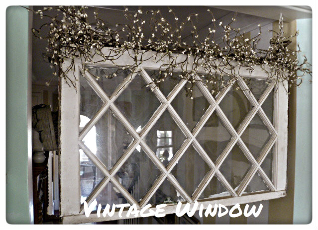
I hung this vintage window in the doorway
Above the doorway to the breakfast area is a small area perfect for some china
The tin ceiling is a nice way to add some character to that fifth wall
I’m a big believer in “use what you have” decorating.
Rotate your things, give away what you haven’t displayed in years,
don’t feel badly that your taste has changed…that’s good.
Give some things to a young homemaker starting out…
I was really happy when people did that for me.
I have no idea why I felt like writing this today
but there you have it!
Look up…what’s on top of YOUR fridge?
Sharing with
Coastal Charm
Home Stories A to Z
My Uncommon Slice of Suburbia
Embracing Change
Funky Junk Interiors


 I'm Lorraine. I have a love for home & design and I enjoy sharing that passion with others. I'm so glad you're here to join me.
email: missflibbertigibbet@gmail.com


I soo agree ..no cereal boxes please ..lol
Your house is always so pretty ..and I love the new blog design ..fabulous !
Well, I have no cereal boxes, but with almost no storage in my kitchen, I have resorted to having 2 baskets with all of our bread, tortillas, and crackers in them.
I recently pulled down my over fridge shelving and replaced it with open shelving. Use them for what i hope is attractive storage. Much better utilization of space. Love your vintage scales. What does a swift do?
Chatty Cathy…I think that works great! The necessaries are just out of sight!
Somewhat Quirky….A swift takes yarn or thread and winds it so it can be used without tangling….but, I’m not real sure that’s even what it is!
Wine is on top of my fridge. I should probably rotate that huh?
~Bliss~
old seltzer bottles & a vintage basket on top of my fridge. great post-love your gradma’s basket! 🙂 chris
Love your collection! My fridge top is empty!
The vignettes make your home a one-of-a-kind. Very special.
Use what you have girl! Preach it! That is so me. Love the advice – thanks for coming by to link up! I would love for you to come back again!
Stacey of Embracing Change
Love your collection! Very special!