We believe strongly that our home is an extension of us and our faith.
Already, in the 11 years we have lived here, we have had three sets of people live with us
for an extended period of time because they had a need.
Now, as most of you know, we have taken in five children who needed a home.
So even though our plans for finishing some of the areas have had to be put on hold,
it is still a very beautiful home and one in which we are privileged to live.
where we married. So this is the fifth home we have created together.
The first time we were in our 20’s and this time we were in our 40’s.
We noticed a difference for sure!
a 10 x 50 foot mobile home ….where we had two kids and a dog…
what can I say, we were young and crazy!
So, I know what it is to live in a small place even though we are blessed to have this large, beautiful home now.
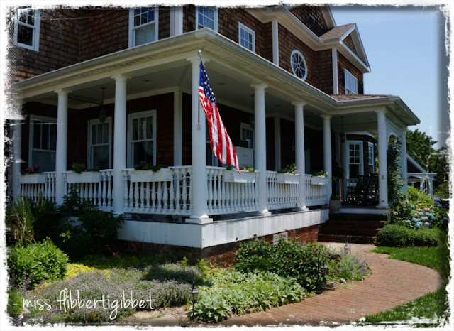
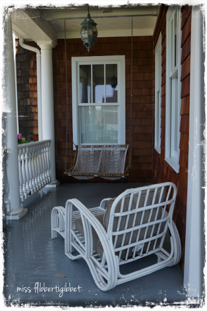
And plenty of room for rocking chairs!
This style is so vintage and is often seen in coastal regions,
particularly in New England.
(I’m channeling Revenge here…the house to die for)
I felt it could lean toward country or city, casual and sophisticated at the same time
Plus, we would now be on the water and it seemed very suited to the setting.
My husband took architectural design in school and could draw the plans.
I took some similar classes as well so had an understanding of blueprints and space.
We worked well together…as long as he did whatever I wanted…LOL!
He made a promise to me when I agreed to move from our former house. I had always wanted to remodel an older home but, being the builder he is, he said
“absolutely not”.
Older homes so often need new electrical, new plumbing, have no insulation, may have foundation issues….and on and on he would go!
However, he did promise that he would build a house that looked old
and so I agreed to leave my completely remodeled house that I loved, and move out here to an area I only visited once a year when I picked strawberries!
I mean there wasn’t even a TJMaxx!!
The house took 18 months to build.
We were both working full time on this go round, so we had the framing done,
the siding put on, the masonry done and the plumbing/gas done.
We were not comfortable doing the natural gas ourselves.
Everything else was us, including my husband building all the cabinetry you see anywhere.
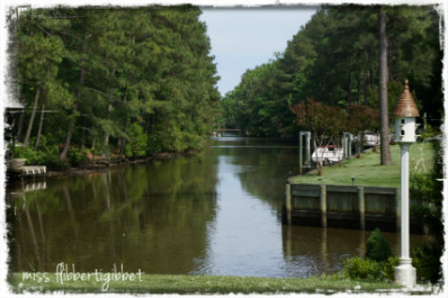
One if the things that sold us on the land, was the view.
None of this was developed along the right side and we initially looked at that opposite lot you see behind the birdhouse.
But once we came to this lot, and saw how long the view was,
we knew we had found the place for us!
My husband grew up in the tidal area of South Jersey near Atlantic City.
He had his first boat when he was 11yrs old and he really wanted to live on the water when he retired. So, this was just perfect.
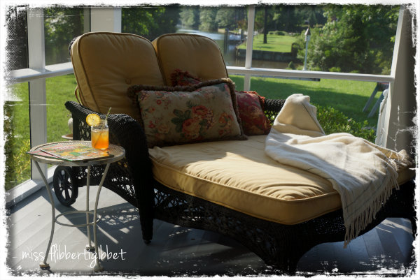
A screened in porch in a coastal area is almost a necessity.
We are fortunate here to have lots of dragonflies, fish in the creek and birds
who do a fair job of keeping mosquitos away.
It’s a great spot to lay and look at magazines……
I should do that one day…..
On the opposite side is this great big sofa we found on sale at Kettler many years ago.
There’s also a view of the water if you sit on the right end of the sofa!
older areas of Norfolk, our neighbor city.
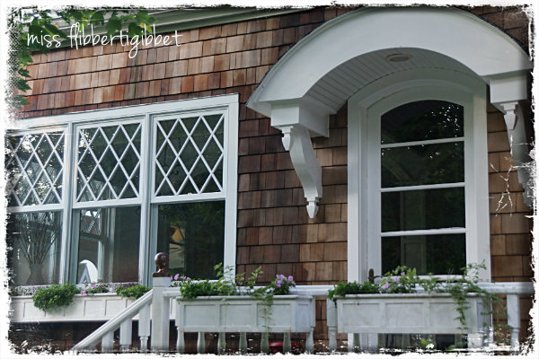
We saw many exterior details that we loved.
I noticed that windows were not always exactly the same,
as you often see in more modern houses.
We used that theme in our design.
To the right of the porch is the breakfast area.
Above that is the balcony off our bedroom and the corner set of windows
are those over the tub in the master bathroom.
The balcony…from below
and from the bedroom…
There was also a real attention to detail in all those older homes
and we loved some of the
small curved roofs over doorways, an idea we used as well.
This is the back door off the breakfast area.
were the gracious spaces inside.
stairways were generous and there were often transition areas between rooms.
The house only has three bedrooms but they are generous and each has a private bathroom.
As you look through that arch, to the right is a bathroom and to the left is a closet.
My talented husband did this ceiling in the small transition area…isn’t it great?
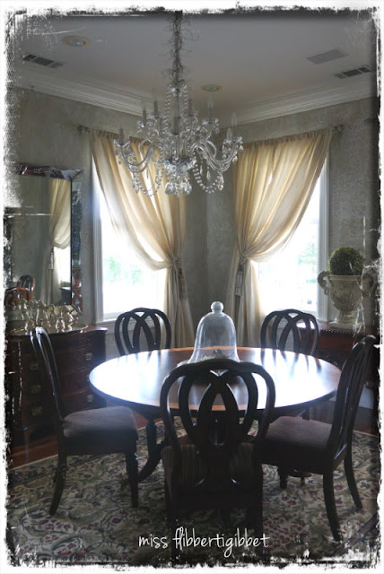
To the left of the foyer is the dining room. I just repainted it.
You can see the before here
Here it is in the building stage
And finished…
Yes, those chairs are pink…but they were only $10 each! i couldn’t pass them up.
Something else to slipcover…
On the opposite side of the living room is the fireplace.
I still have the Spring decorations up.
I used an image from the Graphics Fairy to do the mirror.
There is a small step up to the breakfast area and then we’ll go into the kitchen…
Turning completely around leads into the kitchen
To the left is the refrigerator…in the aqua cabinet!
Back to the entrance from the breakfast area…
to the right is the sink area.
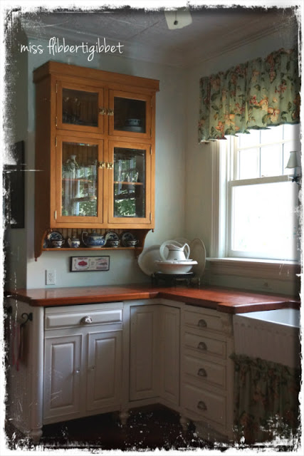
This kitchen was our greatest feat in building this house I think.
Remember, I told you that my husband did all the cabinetry.
He had to plan it all and build it before we started the house….
can you imagine?
Once we began building, he knew he just would not have the time
to devote to cabinetmaking; it had to be done in advance.
We measured SO carefully and had our hearts in our throats the day we installed everything.
It all fit beautifully!
When we designed the kitchen we took a lot of inspiration from
Smallbone of England and Plain and Fancy, here in the US.
We even drove to DC to visit a Plain and Fancy dealer so we could see the cabinets in person.
Something that many of you who are younger may not realize, but at the time we built, it was very difficult to find anything like this for sale anywhere here.
I was seeing this kind of ‘unfitted’ kitchen in my decorating magazines but it was not a common thing like it is now.
Notice the pot filler above the stove?
We had to order that from Chicago because when we asked about it here
everyone said “a pot-what?”.
Same for the clay farmhouse sink…..had to get that from England.
Now, of course, you can walk into Home Depot or Lowes and find all these things easily.
So this kitchen is a real victory for us!
The island is oak and the countertops are American Cherry…
all made by my husband.
He really deserves a lot of praise for all the hard work he put into this home!
Everybody clap!!!!!
He built these matching glass fronted cabinets out of maple.
On to the upstairs…which is much shorter…I promise!
Upstairs is a good example of space used up in just hallways and transition areas.
What most contractors would deem “wasted space”.
The stairwell was completely closed except for a short bit in the foyer.
We wanted more openness in this house.
as I mentioned before..
Here is the master bedroom.
It is completely covered up
I also don’t like to see towel rods just stuck on a wall
I am a teeny bit proud of the tilework because
Let me tell you at this point that you
See I promised the upstairs would be short!
And thanks to all of you for visiting our home!

















 I'm Lorraine. I have a love for home & design and I enjoy sharing that passion with others. I'm so glad you're here to join me.
email: missflibbertigibbet@gmail.com


